What is Data Visualization?
Data visualization refers to the use of visual representations, such as graphs, charts, maps, and other graphical elements to help people understand and make sense of data.
The main aim of data visualization is to provide insight into the data at hand and enable users to delve deeper into the data via various analysis methods. Visualization can also be used to inform the audience about a specific topic.
Visualization can be roughly divided into three main branches: scientific visualization, information visualization, and visual analytics.
Scientific Visualization
Scientific visualization focuses on data with spatial or temporal properties, which includes any measurements from real-world systems or simulation results. Examples include functional MRI visualization of human brain, movement of people or vehicles in a city, engineering simulation results (e.g., finite elements methods analysis), or geographical and physical characteristics or a region.
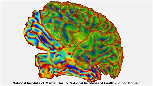
The visualization is generally done using spatial information, drawn on a 2D or a 3D space with the help of computer-generated imagery, augmented reality or virtual reality tools. For complex data such as volumetric data or time-dependent data, many approaches exist to make the data easy to understand for human viewers, e.g., getting slices of volumetric data or including time aspects with animation or interaction.
Information Visualization
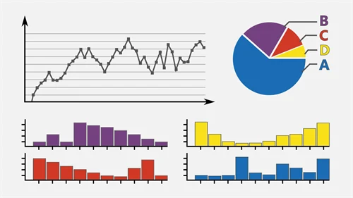
Information visualization is the use of visual representations, such as graphs, charts, and maps, to help people understand and make sense of large amounts of information. Its main aim is to identify patterns, trends, and relationships in data, and to facilitate decision-making and problem-solving. Information visualization mainly focuses on abstract data which does not have a direct spatial meaning.
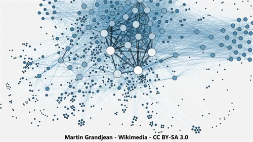
Information visualization is generally done using marks or glyphs on mostly 2D but sometimes also on 3D spaces, with the help of computer graphics tools. These tools can visualize structured data in the form of charts (e.g., bar, pie, line) and unstructured data with relationship information (e.g., graphs, trees).
Visual Analytics
Visual analytics is a field that combines data visualization techniques with other analytical methods to help people make decisions and solve problems. The goal of visual analytics is to provide users with a rich, interactive, and intuitive environment that enables them to analyze and explore large, complex, and dynamic datasets.
Examples of visual analytics include using interactive dashboards to help business analysts, executives, and decision-makers explore and analyse data from multiple sources (such as sales data, customer data, and market data), using network visualizations to help security analysts identify and understand the relationships between different entities (such as people, organizations, and devices) in a network.
More Information on InfraVis Project
Mid Sweden University is one of the founders of a recently founded national research infrastructure for data visualization: InfraVis. You can get more information about InfraVis project via below links: